
 View in the ChatGPT registry
- Brand
- esigna
- Category
- Content & Design
- Primary Subcategory
- Pending
Integration details
Description
Describe yourself and the impression you want; esigna designs with you. See design directions side by side, refine by conversation or by hand in the full Editor, add your own Photo and logo, preview it in light and dark inboxes and on a phone, then copy it into Gmail, Outlook or Apple Mail.
- Integration type
- Plugin
- Verification status
- Not applicable
- Platform
- ChatGPT
- Primary Subcategory
- Pending
- Secondary Subcategories
- None listed
- Brand
- esigna
- Access
- No account required
- First tracked
- 2026-10-09
- Tool count
- 13
- Geography
- US
The Primary Subcategory used for this profile’s headline score.
Other Subcategories where the Integration is listed.
 Agent DiscoverabilityChatGPT Plugin Discovery Score
Your score is coming
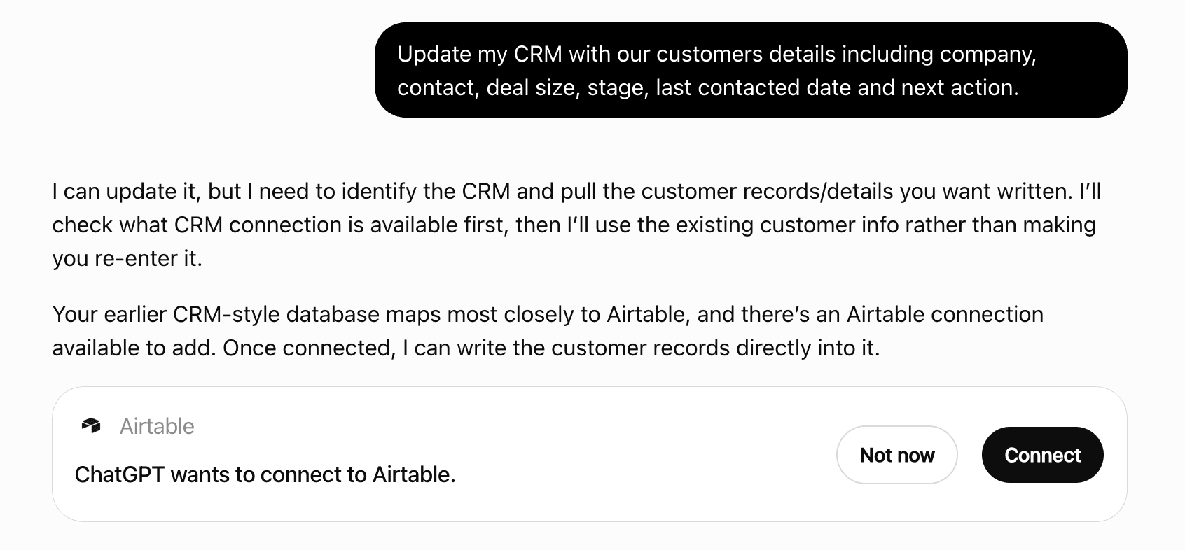
ChatGPT now suggests Plugins on its own when they match a user's request.Your Plugin Discovery Score measures how often yours appears, and it will show here as soon as it’s ready.
What discovery looks like
Get alerts for esigna
Get updates when esigna’s Discoverability Score or category rank changes.
Competitive lineup
13 tools agents can invoke

esigna ChatGPT Plugin FAQ
How the directory, categories and Discoverability Score work.
Read the methodologyHow do I improve esigna's ChatGPT Plugin discoverability?
The levers are the listing surface agents actually read: names, descriptions, keywords, tool metadata, and registry health. Which lever matters depends on where discovery breaks, which is what continuous measurement shows.
Where is this profile measured?
This profile uses the geography attached to the latest public registry snapshot: US. Locale tags are intentionally omitted.